- Published on
Niel Liesmons Joins OpenSats Design
- Authors

- Name
- Gigi
- @dergigi

- Name
- Karnage
A couple of weeks ago, we announced the Nostr Design initiative, which aims to help "take nostr mainstream," to quote our furry friend with purple-colored glasses. As Karnage wrote in last month's post, he and Daniele are leading the charge of making the user-facing side of nostr better, prettier, more intuitive, and more accessible. And since all good things come in threes, we're pleased to announce a new addition to the OpenSats design team: Niel Liesmons.
Niel is an Industrial Designer who is now bringing his years of making beautiful and convincing presentations for his designs to the world of nostr UI & UX. He will help make NostrDesign.org and the clients that implement its best practices better and more beautiful, which is another way of saying easier to understand and use.
In addition to welcoming Niel, we want to take a minute to reflect on where we've been, where we are now, and where we might go in the future. Not in terms of the nitty-gritty of the nostr protocol, but in terms of the user-facing side of things.
Undoubtedly, nostr clients have come a long way. The days of incredibly clunky and buggy clients are mostly behind us, and, luckily, you don't need to be a command-line wizard anymore to interface with the protocol. We have native mobile clients, web clients, progressive web apps, and more. Most of them are pretty useable, and, dare I say it, some of them are even pretty.
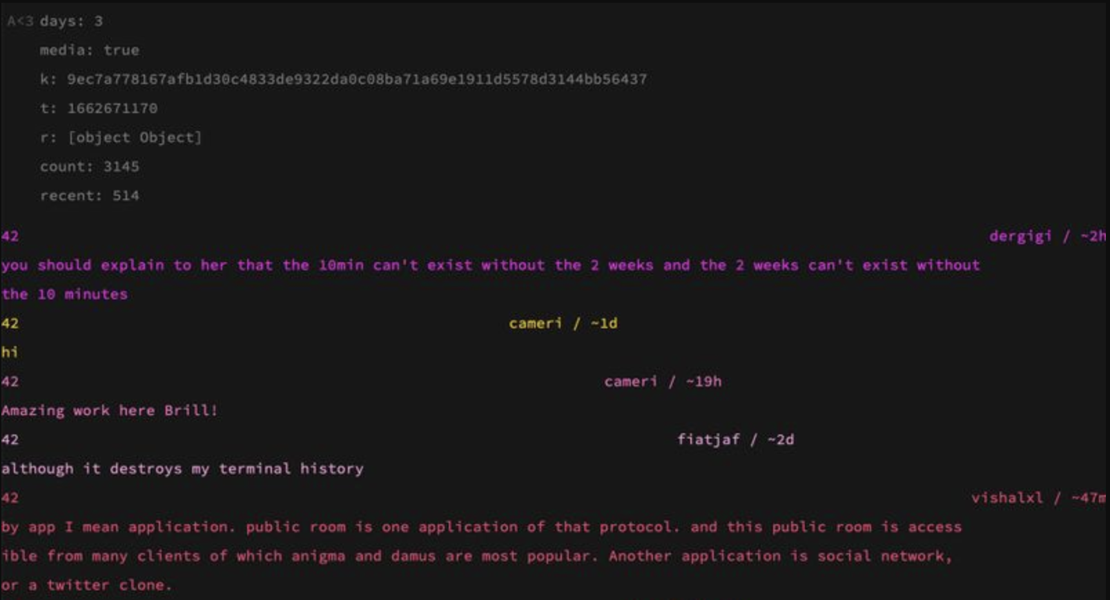
Yes, the user experience of most nostr clients still has long ways to go. However, it's useful to remind ourselves of where we've been just 18 months ago. The best-in-class nostr clients looked something like this:
Okay, okay. I exaggerate. But not by much! Some nostr OGs will look at this screenshot with a smile that only nostalgia can produce. All great things have humble beginnings, and nostr is no exception. Most great things adapt, evolve, and improve over time. And nostr is no exception in that regard either.
As more developers and designers join the flock of nostriches that cares about a social web that is free as in speech, the UX of nostr clients is bound to improve. We hope that a resource like Nostr Design as well as active client reviews such as the one below will help along the way.
We've got great feedback—from developers and designers alike—for the Nostr Design resource that was put together over the course of the last few months. Karnage, Daniele, and Niel will continually improve NostrDesign.org, so please keep your feedback coming!
Here's some success stories that developers have shared with us:
- Lume improved their onboarding based on our feedback
- 0xchat made various UI improvements
- noStrudel is implementing recommendations
- Spring in its current shape is based on NostrDesign recommendations
The short list above is far from exhaustive. A lot of the work is currently ongoing and in early stages.
If the work we are doing was useful to you, please let us know! Reach out to us on nostr or write us at design@opensats.org. We're happy to hear any and all thoughts, suggestions, ideas for improvement, as well as have lively discussions on how to best design the strange and beautiful experience that is nostr.
We have great plans for our design initiative and can't wait to see all the amazing stuff that is going to be built. Onwards!


